These days, more companies are seeing accessibility and inclusion as an important part of their company culture. And frankly they should, not only because of regulations such as the Web Content Accessibility Guidelines 2.0 (WCAG 2.0) and the European Accessibility Act. But also because accessibility is a business imperative. Research shows that companies that embrace best practices for employing and supporting people with disabilities in the workplace, outperform their peers. More specifically, these companies experience a 28% increase in revenue, two times higher net income and 30% better performance on economic profit margin (The Disability Inclusion Advantage, 2018). One of the companies that has proven that accessibility can be a business imperative is NPR Weekly Broadcast. When they transcribed their entire archive of recorded programs, the search traffic increased with 6,86% and the number of unique visitors increased with 4,18% (The Business Case for Digital Accessibility, 2018). Also, the transcripts lead to an overall better user experience as users who speak English as a second language could better comprehend the recordings, users could still understand the recordings in noisy environments and the ability arose to search text in order to reference a specific section of audio. Altogether, this example of NPR Weekly Broadcast shows that making your products and/or services more accessible for people with a disability leads to a better user experience for all users, which leads to a higher rate of product and service adoption in the end.
That inclusion leads to an overall better user experience, is also illustrated by Floris’ experiences. For instance, “Due to my reduction in vision, I often struggle with finding the toilets in a building, finding my colleagues during lunch or simply finding the exit of a building. So, when my employer remodeled their office, they asked me to give feedback regarding the signs and other elements to make our office more accessible. As a result, the signs to locate the toilets are now in clear font, bigger letter size and higher contrast. Consequently, these readable signs not only benefit people with a reduction in vision, but it also makes it easier for new-hires and visitors to navigate around the office. In my opinion, you could say that disabilities serve as an inspiration for better solutions and thus inclusion is an engine for innovation.”
Accessible Design vs Inclusive Design
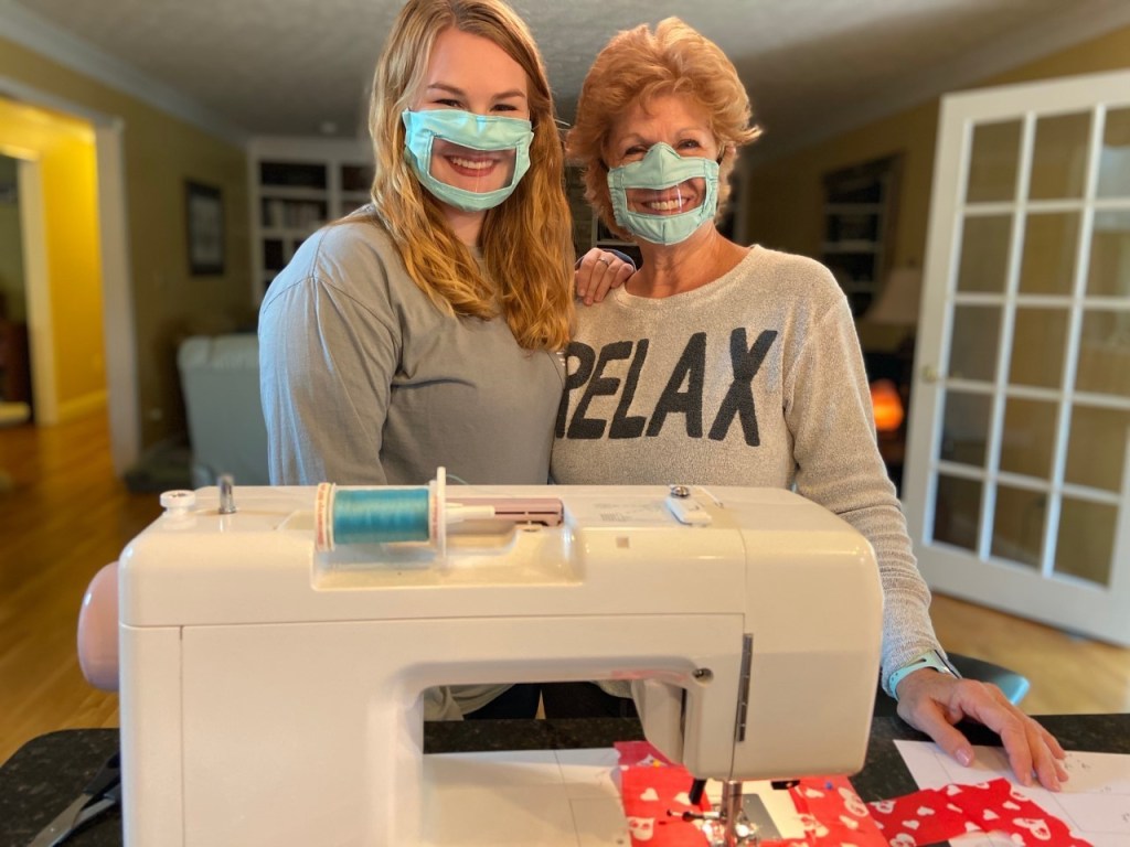
There are two ways to approach design that can solve challenges related to accessibility: Accessible Design and Inclusive Design. However, it is important to note that there is a difference between the two. Accessible Design is outcome-based and focuses on designing usable products specifically for people with a disability. This often goes hand in hand with following accessibility guidelines published by various governmental and industry groups (Chapman, n.d.). For example, with the Covid-19 pandemic there is an increasing need for wearing a facemask. However, college senior Ashley Lawrence noticed that face masks covering the mouth are not accessible for people with hard of hearing (Kopsky, 2020). This because people with hard of hearing are often dependent on speech reading and lip reading. Based on this insight, she came with the idea to make interaction between people with face masks more accessible by placing a transparent plastic window where the mouth is. According to Lawrence the plastic window is a necessity for anyone who uses speech reading, lip reading, and even for those who use sign language of which body language is an important part.
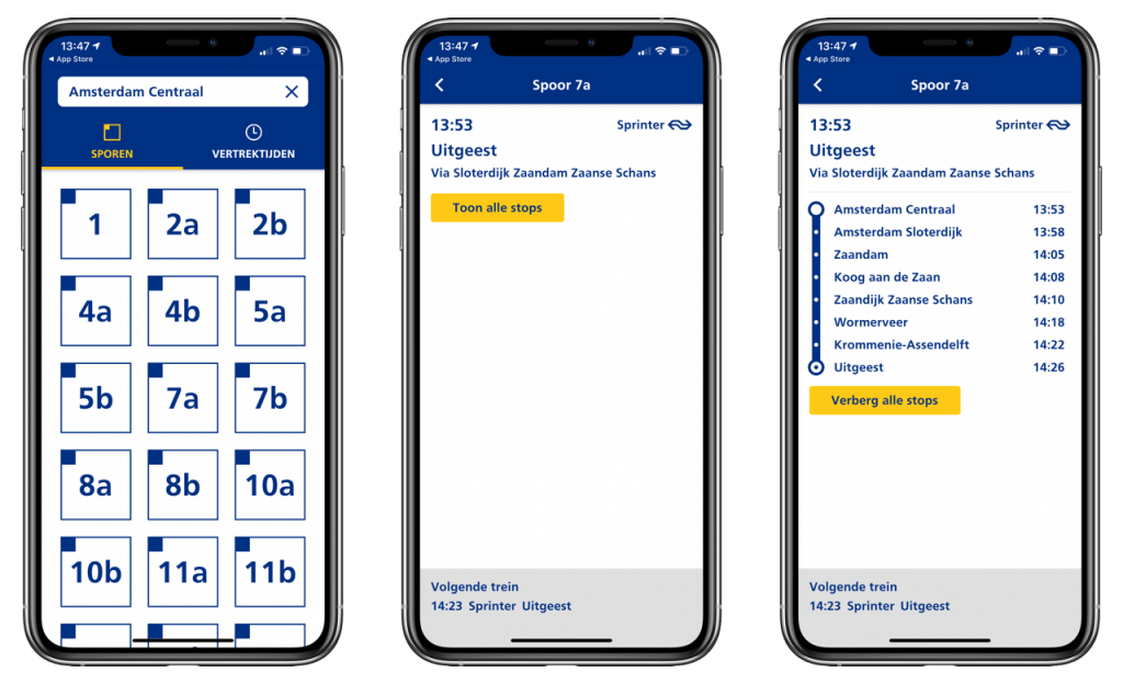
Another example of Accessible Design is an app developed by the Dutch Railways. The company noticed that the physical train platform signs are not accessible for people with a visual impairment (NS Perronwijzer-app, n.d.). This because the signs are often too far away, and the font can be too small. To make reading the platform signs more accessible, the company decided to develop a separate app, called NS Perronwijzer. In the app, the user can select a platform number and consequently can read the platform sign information on their phones in a bigger font. In addition, a user can also listen to the information by making use of text-to-speech audio.
In contrast to Accessible Design, Inclusive Design is process-based and focuses on designing usable products for everyone. In other words, Inclusive Design does not only focus on designing products for people with a permanent disability but recognizes that exclusion can happen to everyone depending on the context (Chapman, n.d.). As a product and/or service designer it is important to realize that every design decision you make, has the potential to include or exclude potential users. Companies often have the tendency to design separate apps or websites for end users with a disability. However, as Haben Girma (2020) says: “Separate is never equal”. Inclusive Design starts with seeing human diversity as a resource for better designs. It is important to realize that this is not just a new way of designing products and services. In our opinion, you could see Inclusive Design as a mindset which should be integrated into every product and service design process.
“We may not solve all mismatched human-interactions, but small changes in product and service design cycles can make a big difference.”
Floris Horsman
Looking back at the Accessible Design examples given before, you could say that Accessible Design is one step in the right direction. However, Inclusive Design could take it even further. Both examples started with the insight that an existing product is not accessible for people with a certain disability. However, what if we look at it from a broader perspective? What if we say that the overall user experience is lacking, not only for people with a disability, but for everybody depending on contextual factors? E.g. a nervous patient who feels calmer when seeing doctors smile or the sun reflecting on the train platform signs which makes it impossible to read the information. That thought process is Inclusive Design, recognizing that exclusion can happen to everyone depending on the context.
Inclusive Design Methodologies
Over time, multiple organizations, such as Adobe and Microsoft have developed Inclusive Design methodologies. In this article we will discuss Microsoft’s Inclusive Design methodology, which is based on three key principles (Inclusive Microsoft Design, 2016):
- Recognize Exclusion – Exclusion happens when we solve problems using our own biases.
- Learn from Diversity – Human beings are the real experts in adapting to diversity.
- Solve for one, extend to many – Focus on what’s universally important to all humans.
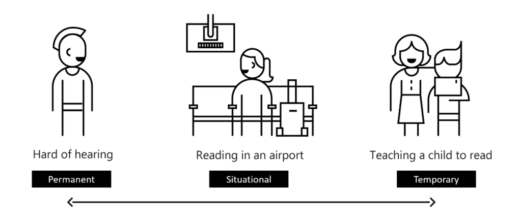
Applying the methodology starts with knowing the basic principles of the Design Thinking process: Empathize, Define, Ideate, Prototype and Test (Siang, n.d.). In addition, the Inclusive Design methodology also introduces new tools, such as the Persona Spectrum. The idea behind this framework focuses on how to look at a disability. Instead of looking at a disability as a personal health condition, we should look at a disability as a mismatched human-interaction. In other words, if there is a mismatch it means the overall user experience of your product or service is lacking. Therefore, you could say that all people experience a disability, whether it is permanent, temporary, or situational. The image below shows an example of a persona spectrum:
More People Benefit from Closed Captioning (CC)
Overall, the persona spectrum helps you in fostering empathy and to show how a product or service can scale to a broader audience. The Persona Spectrum is, together with other support tools, presented on multiple Support cards. The toolkit also comes with Activity Cards which work in tandem with the Support cards. Together they serve as a great introduction to Inclusive Design and they are freely available here.
To conclude, Inclusive Design is all about recognizing that exclusion can happen to everyone depending on the context. Therefore, it is important to realize that every design decision you make as a product and/or service designer, has the potential to include or exclude potential users. All in all, we really believe that every product design cycle should include Inclusive Design principles and hope that, after reading this article, you do as well.
Are you or is your company interested in applying the Microsoft Inclusive Design methodology? Feel free to contact Floris or Josephine to learn more about the services we can provide. Also, if you are interested in learning more about accessibility and inclusive design, please review the following links:
About the Authors
Floris Horsman: On a daily base, Floris experiences challenges in accessibility due to his reduction in vision which causes him to see roughly 25%. However, his positive mindset makes him determined to think about how we can make the world and the environment around us more inclusive and accessible. Today, Floris is a Customer Success Account Manager at Microsoft. On top of that, he is also the Chairman of the Employee Resource Group within Microsoft which focuses on inclusion and accessibility.
Josephine Scholtes: Josephine’s passion for Accessibility and Inclusive Design started with a university project in which she created a guide robot for people with a visual impairment. Today she applies her knowledge on both topics to her role as a User Experience Consultant at Microsoft.
This article was published on LinkedIn
Author: Floris Horsman & Josephine Scholtes
Published: August 2020
References
Chapman, C. (n.d.). Accessible design vs. inclusive design (with infographic). Retrieved from https://www.toptal.com/designers/ui/inclusive-design-infographic
The disability inclusion advantage (2018). Retrieved from https://www.accenture.com/t20181108t081959z__w__/us-en/_acnmedia/pdf-89/accenture-disability-inclusion-research-report.pdf
The business case for digital accessibility (2018). Retrieved from https://www.w3.org/WAI/business-case/
Kopsky, C. (2020). College student makes mask for the deaf and hard of hearing. Retrieved from https://www.lex18.com/news/coronavirus/college-student-makes-masks-for-the-deaf-hard-of-hearing
NS Perronwijzer-app. (n.d.). Retrieved from https://www.ns.nl/reisinformatie/reizen-met-een-beperking/ns-perronwijzer.html
Lovelace, D. and Vinberg, R. (2020). Separate is not equal: Haben Girma & HBO’s ‘Betty’ create equal access. Retrieved from https://yr.media/podcasts/future-ish-female/
Inclusive Microsoft Design (2016). Retrieved from file:///C:/Users/joschol/Downloads/inclusive_toolkit_manual_final%20(1).pdf
Siang, T. Y. (n.d.). Design thinking. Retrieved from https://www.interaction-design.org/literature/topics/design-thinking#:~:text=Design%20thinking%20is%20a%20non,are%20ill%2Ddefined%20or%20unknown.
